role
Designer / Illustrator
classification
Illustration / Graphic Design
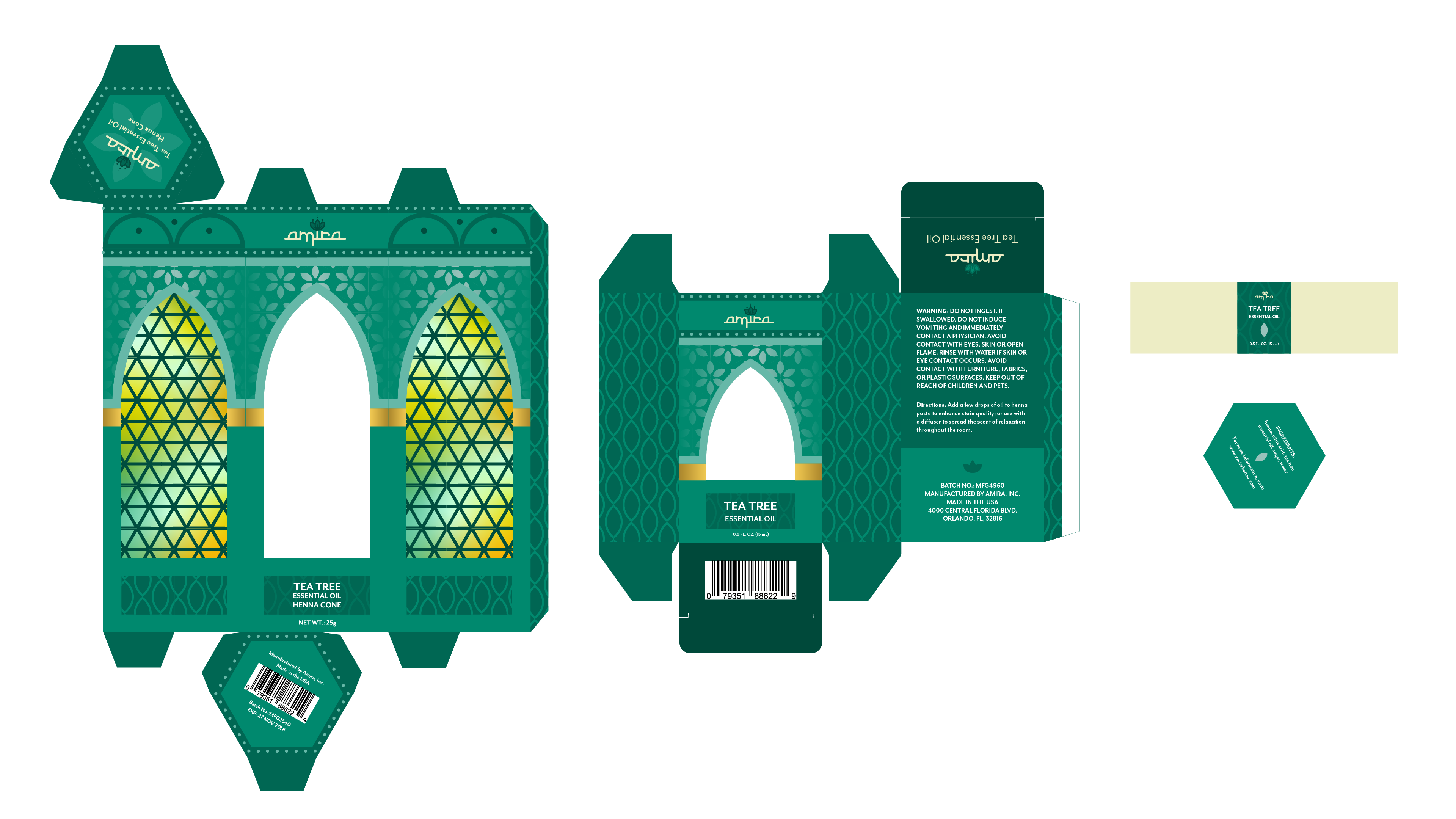
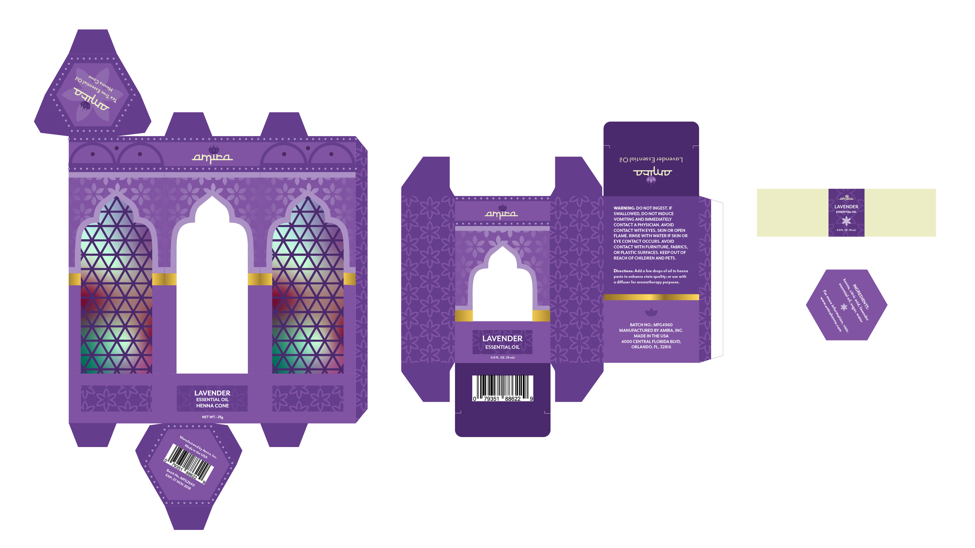
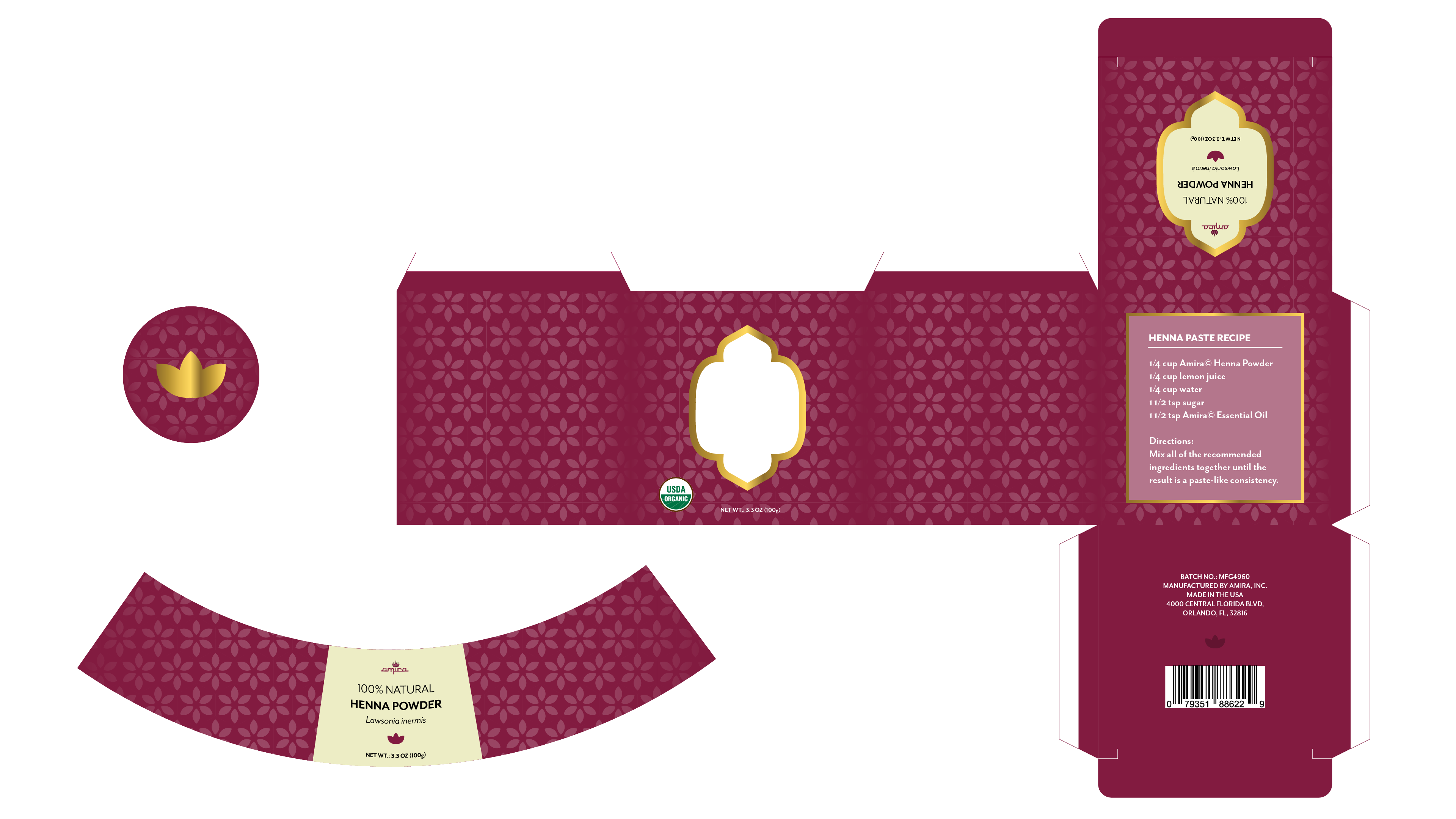
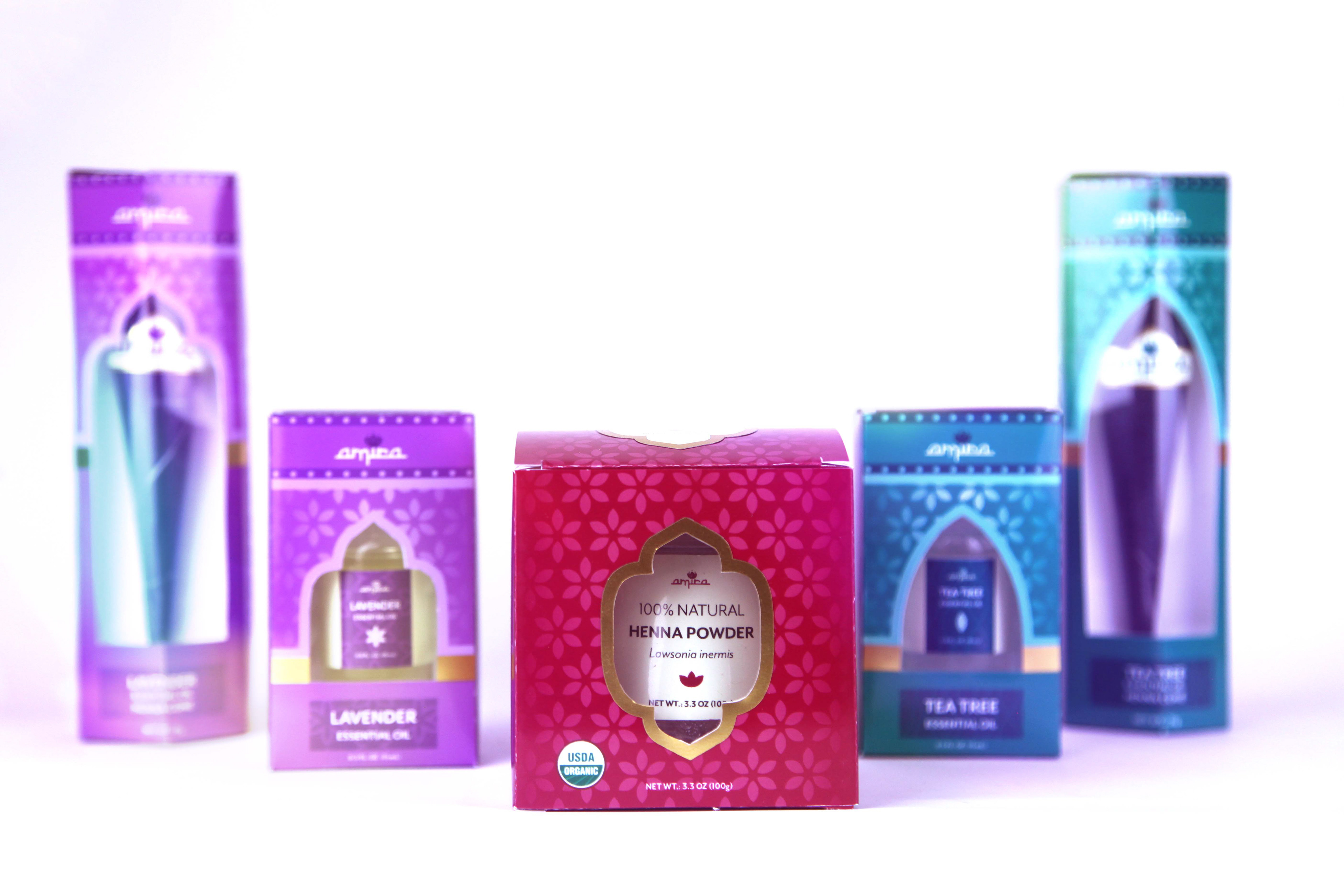
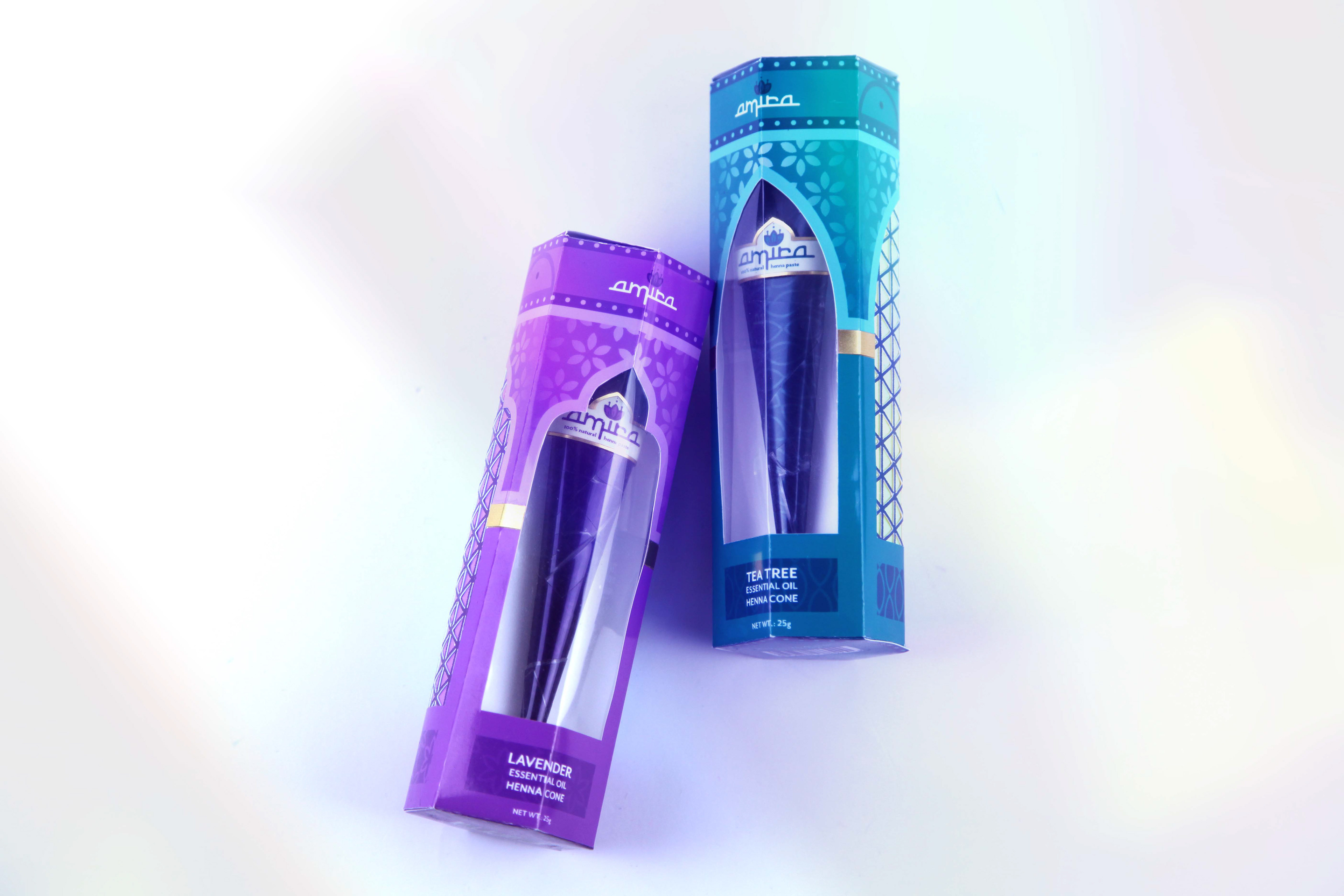
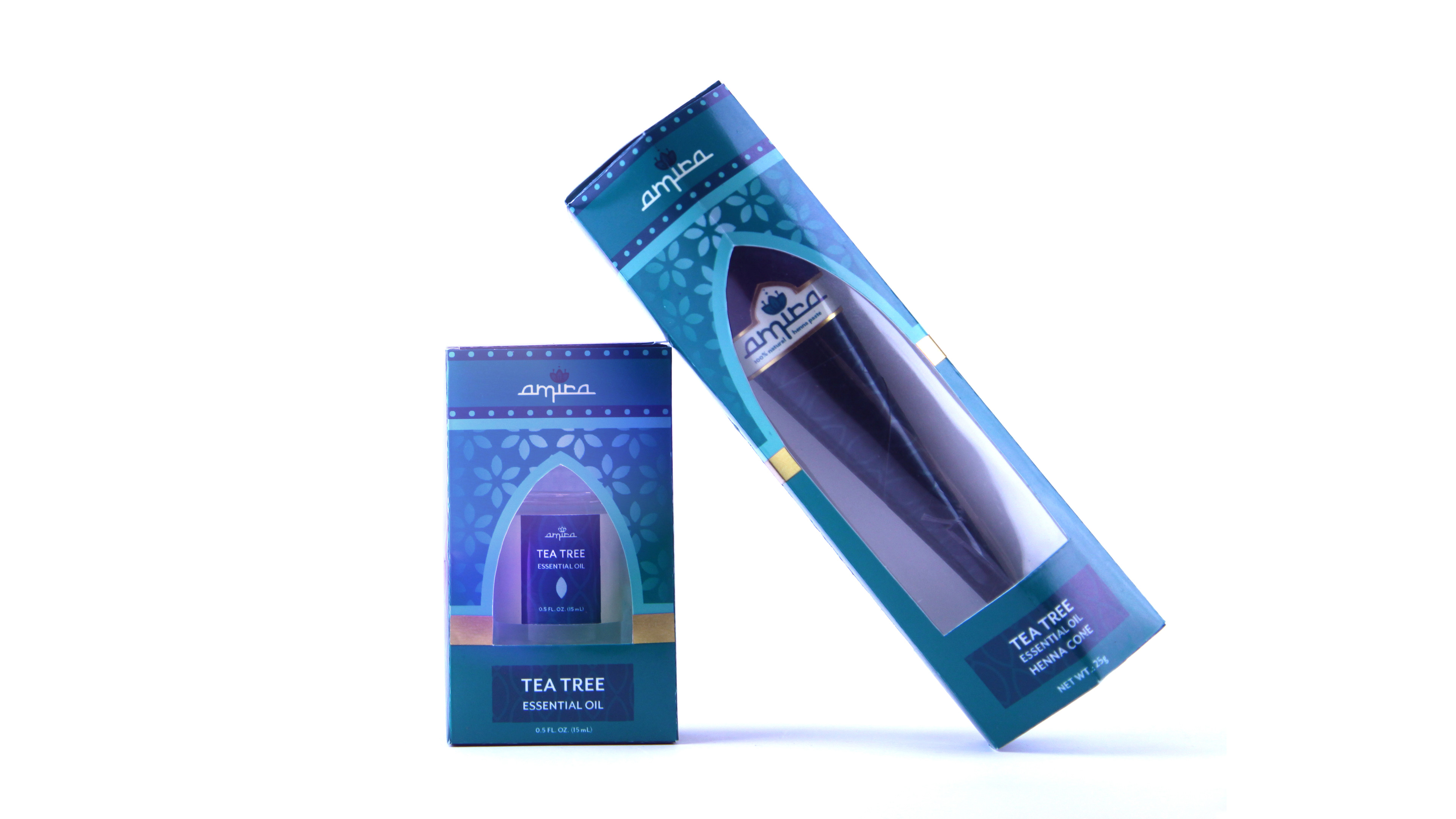
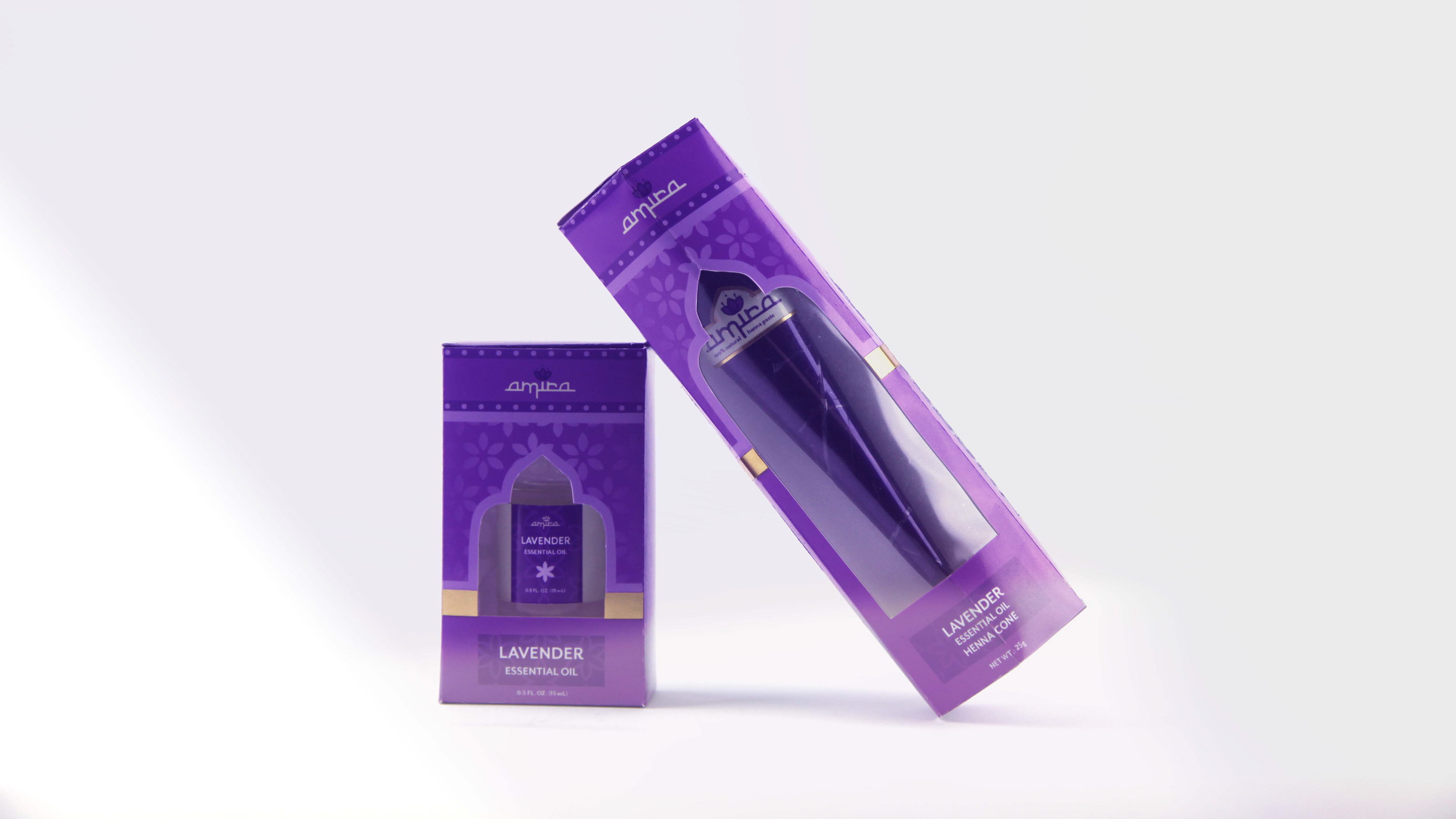
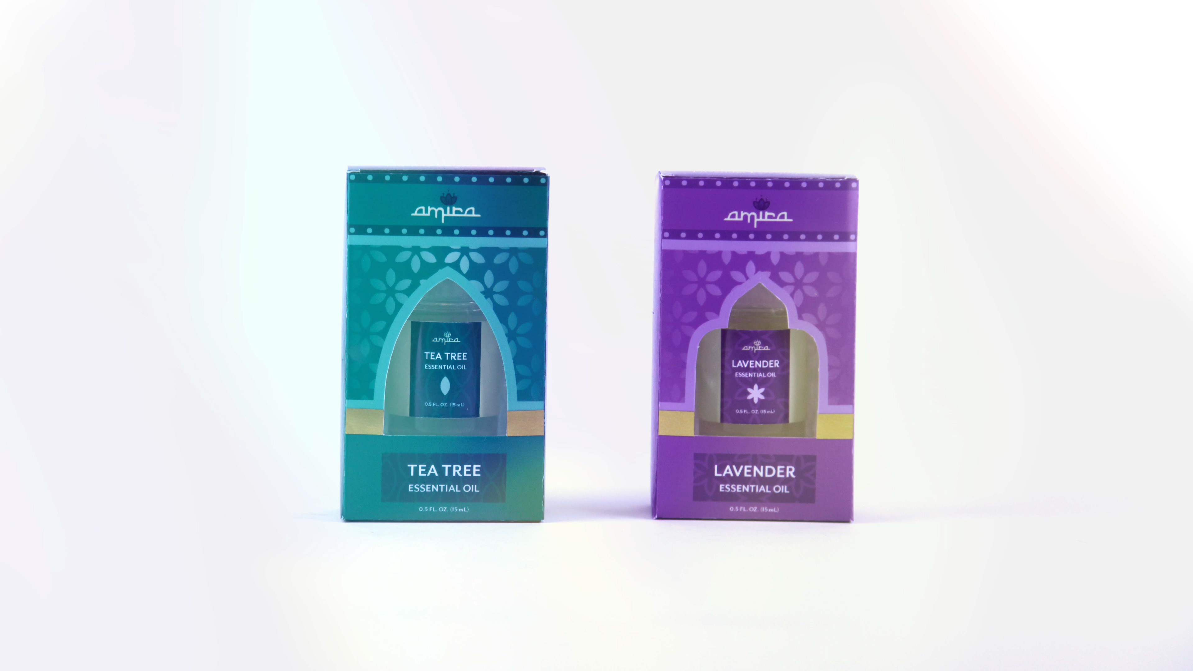
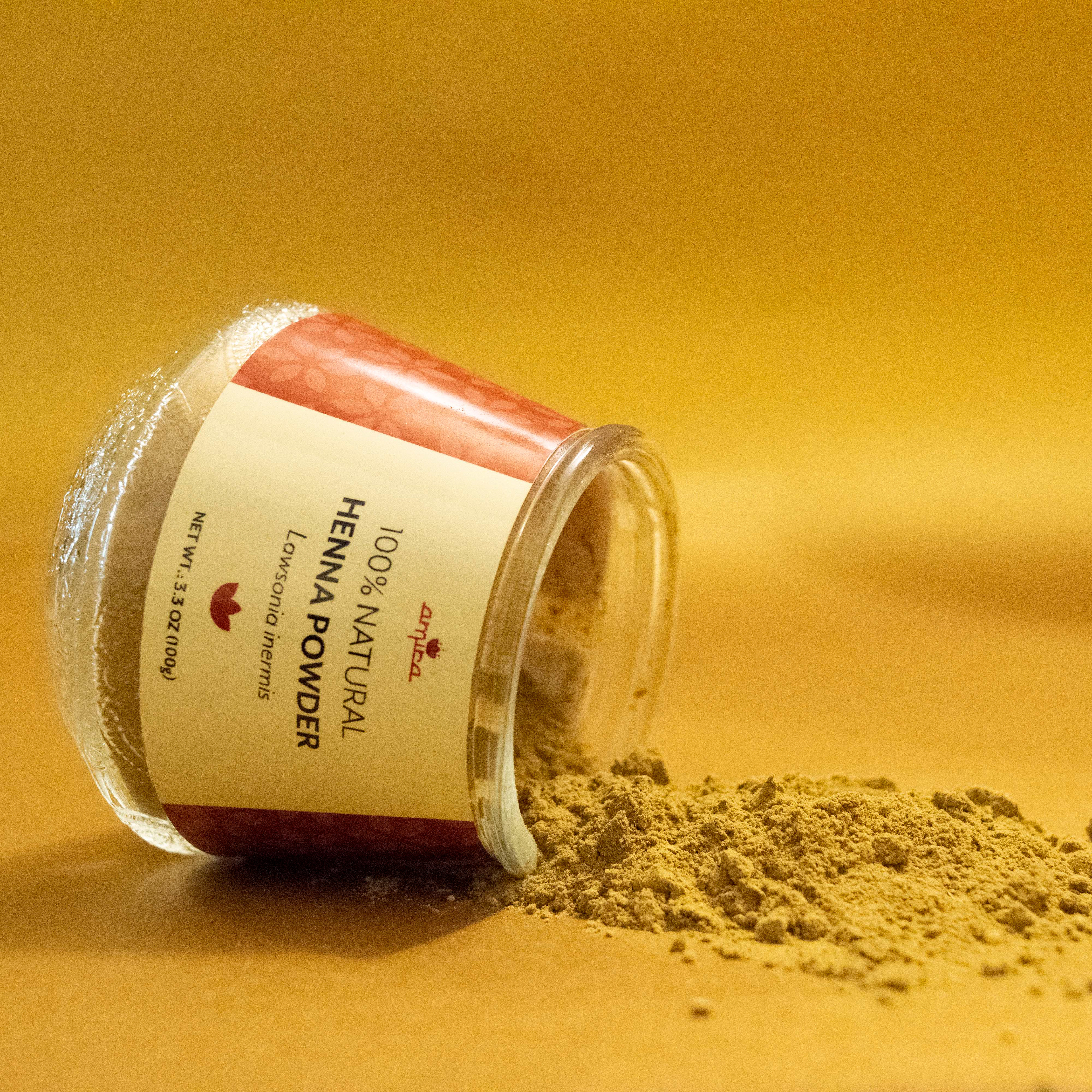
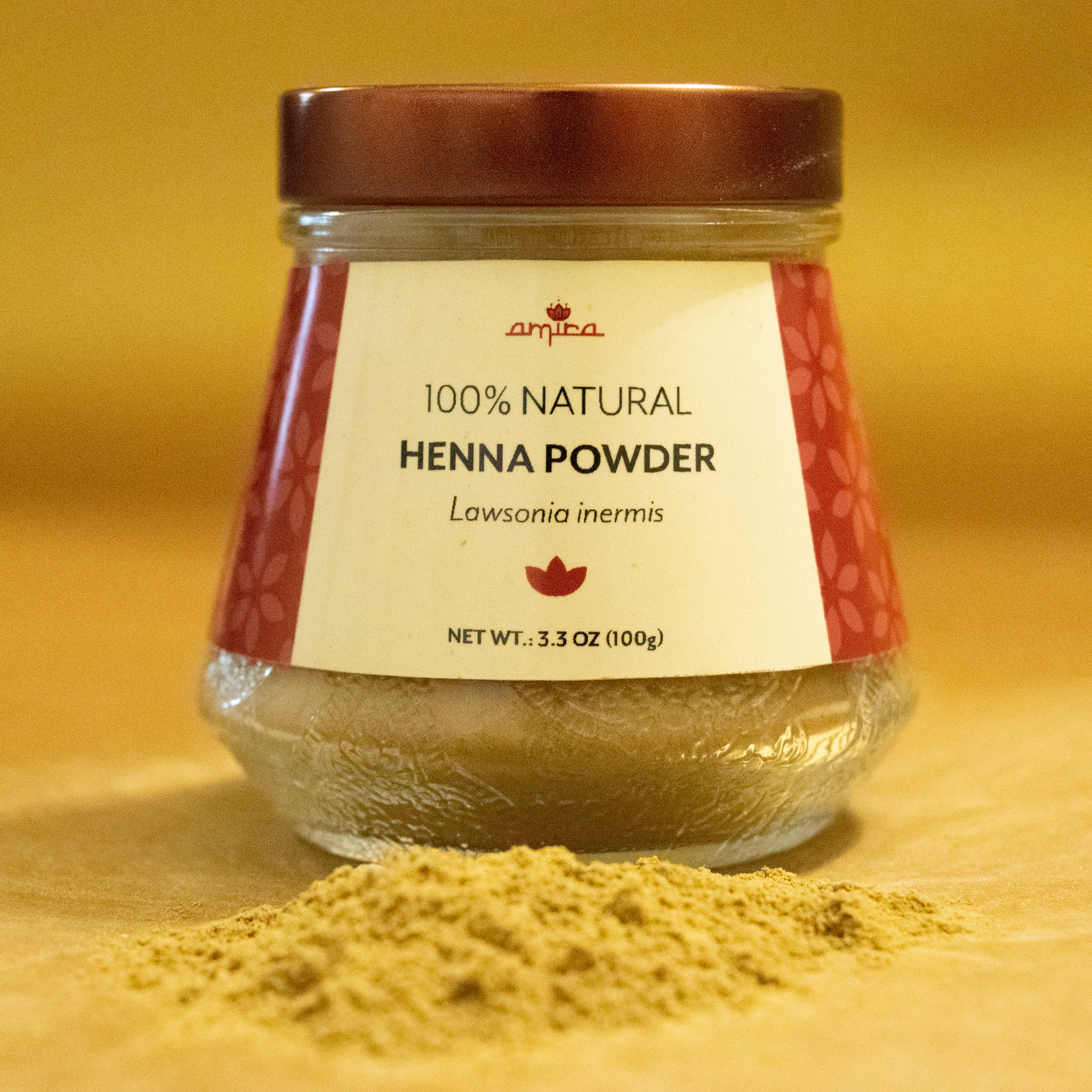
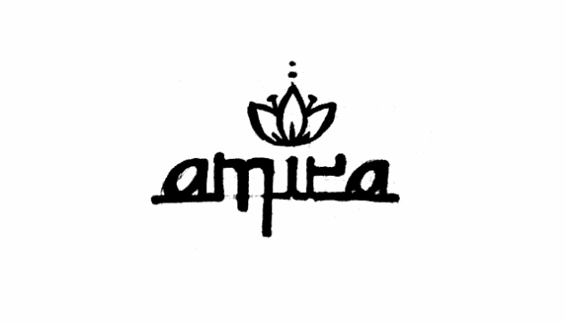
Amira Henna
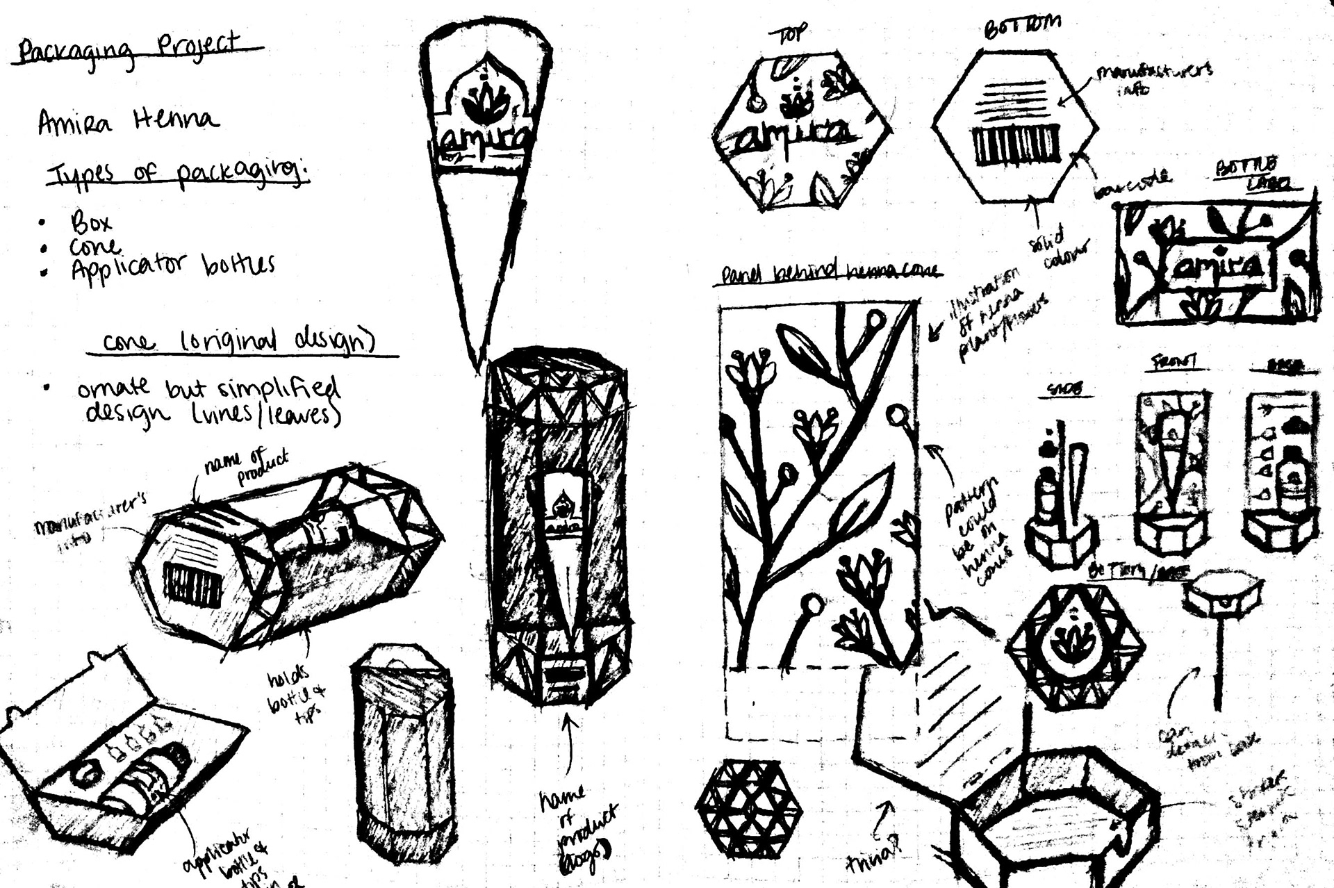
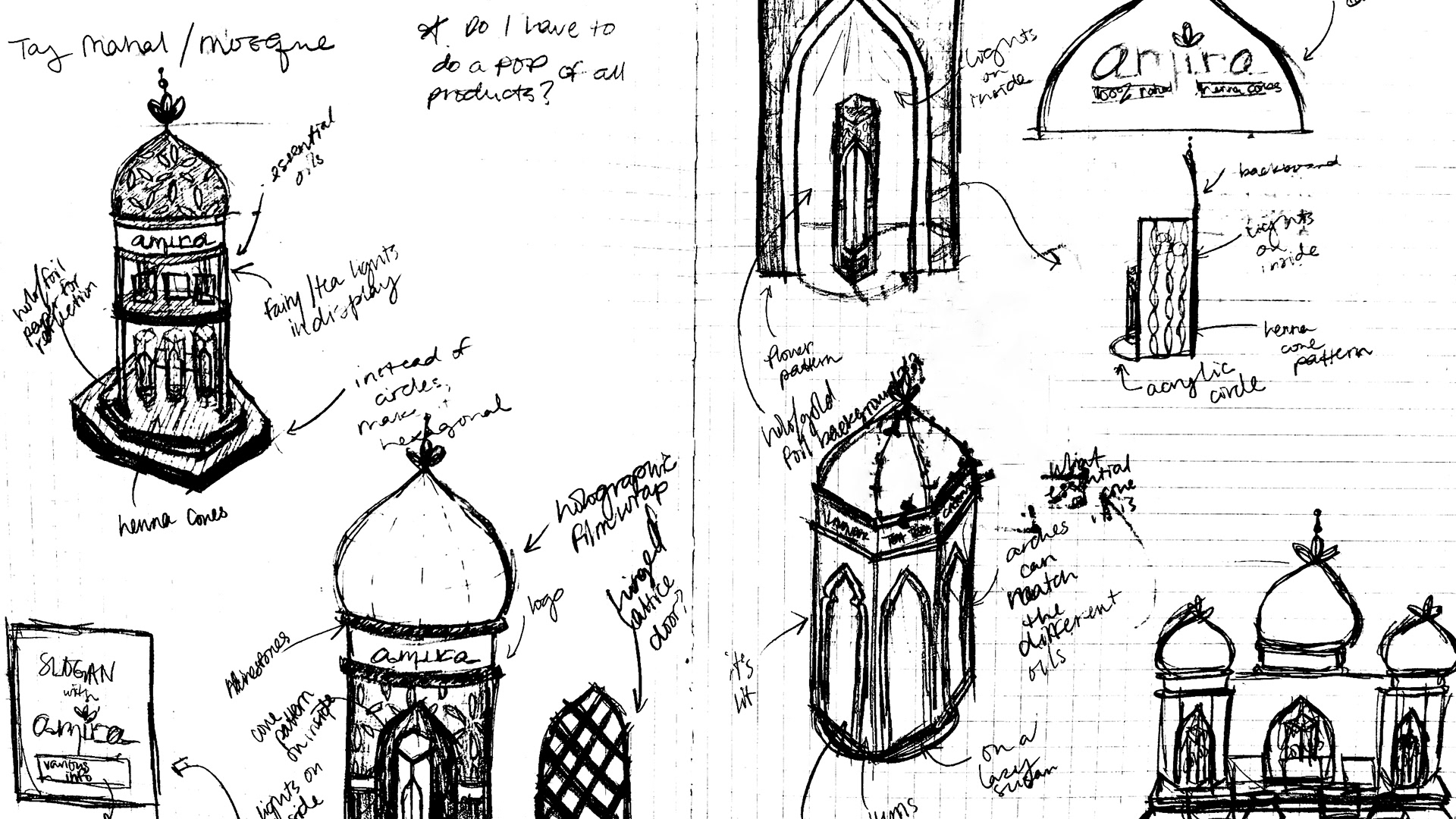
Considering various products that could use better packaging, I thought to package a product I use very often: henna. I wanted to capture the essence of henna and Islamic architecture throughout my design and tell a story to teach others about the cultures that predominantly practice the art in Africa, Asia, and the Middle East. The following explores color, geometry, and typography to cultivate packaging designs rich in culture.
color + branding
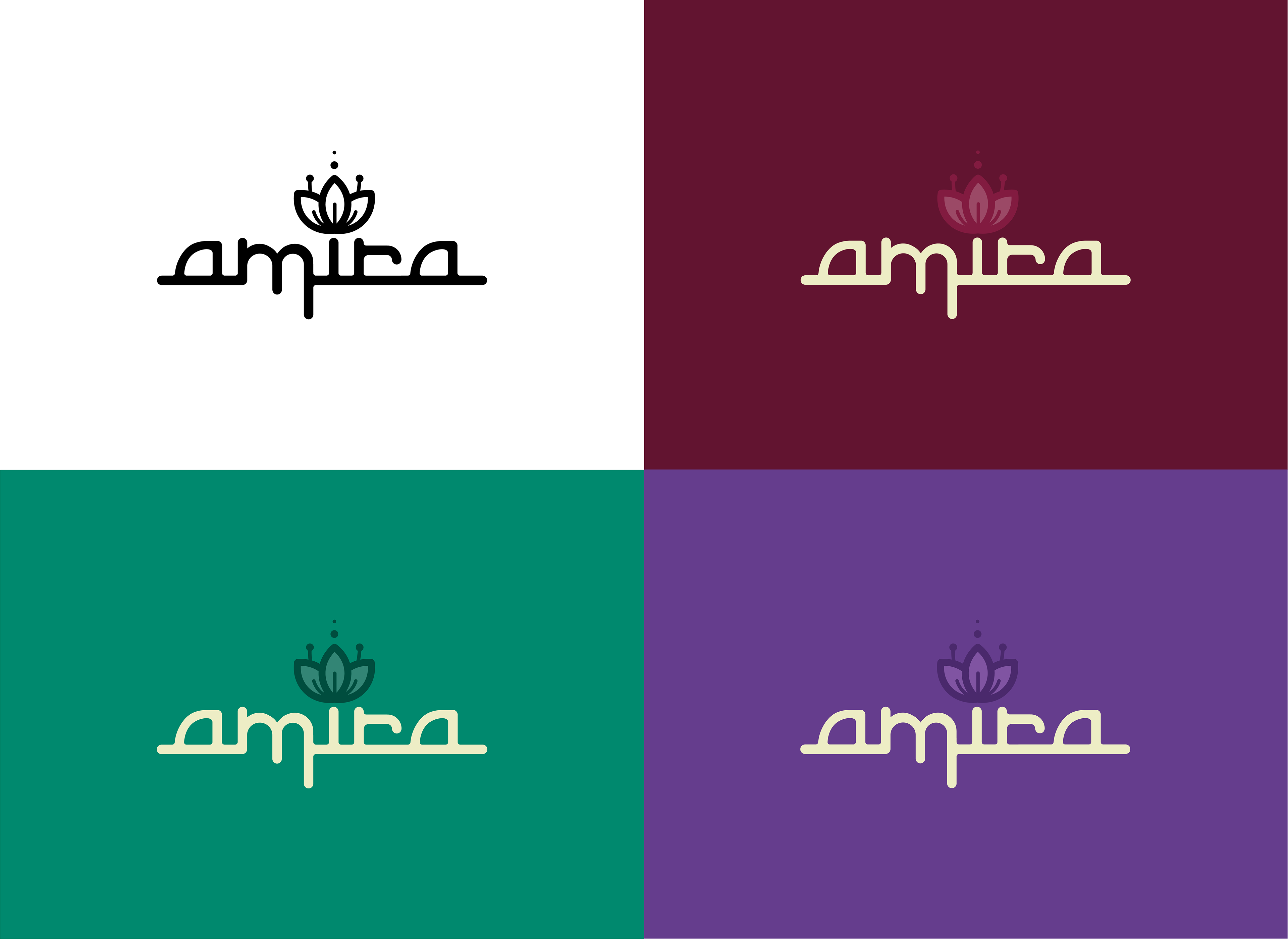
Various essential oils can determine the scent and darkness of the henna stain. With this in mind, I created my main packaging designs for two types of henna: tea tree and lavender essential oil. I wanted to correlate my colors to the essential oils: green for tea tree, purple for lavender, and burgundy for the henna powder that isn't pre-mixed.
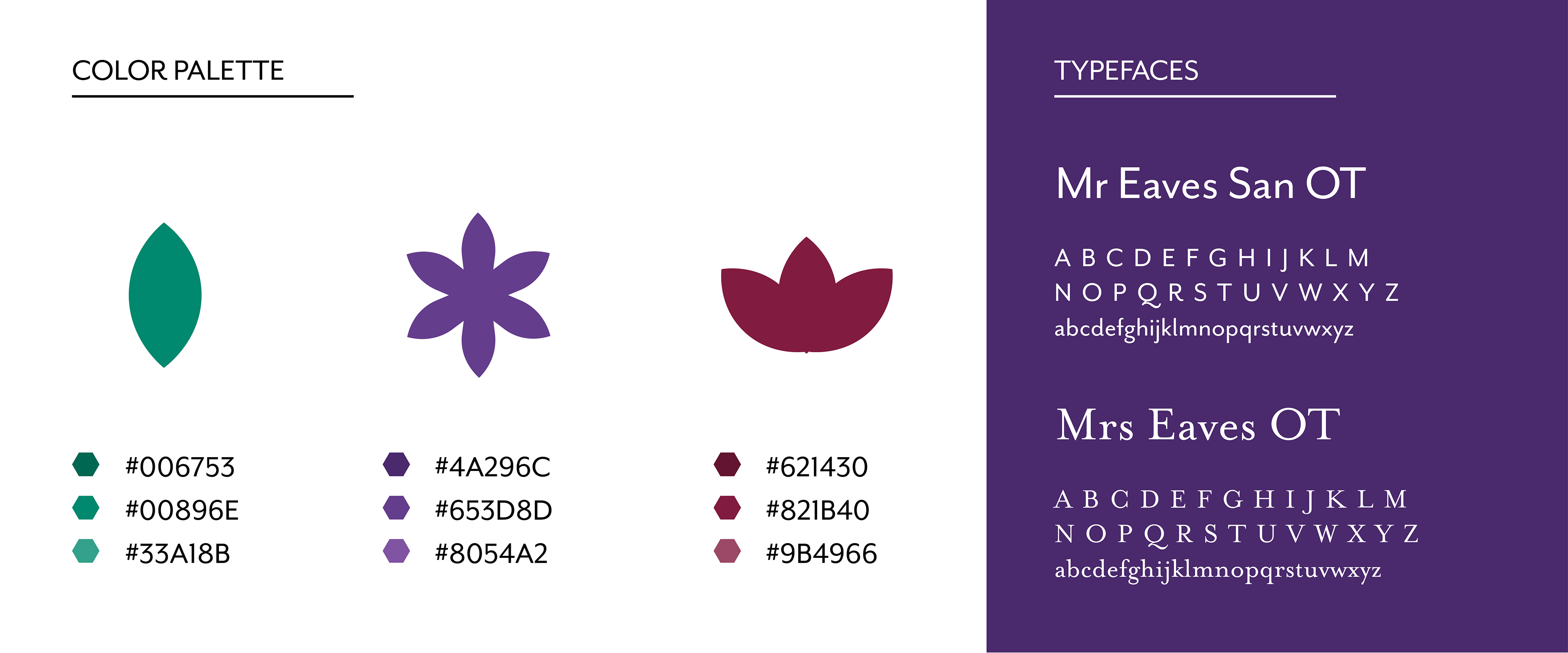
My deep love for Arabic architecture largely influenced my packaging design. Not only did I separate the various products by color, but I also separated them by icon and type of arabesque arch.